Eclair Moi | Case Study
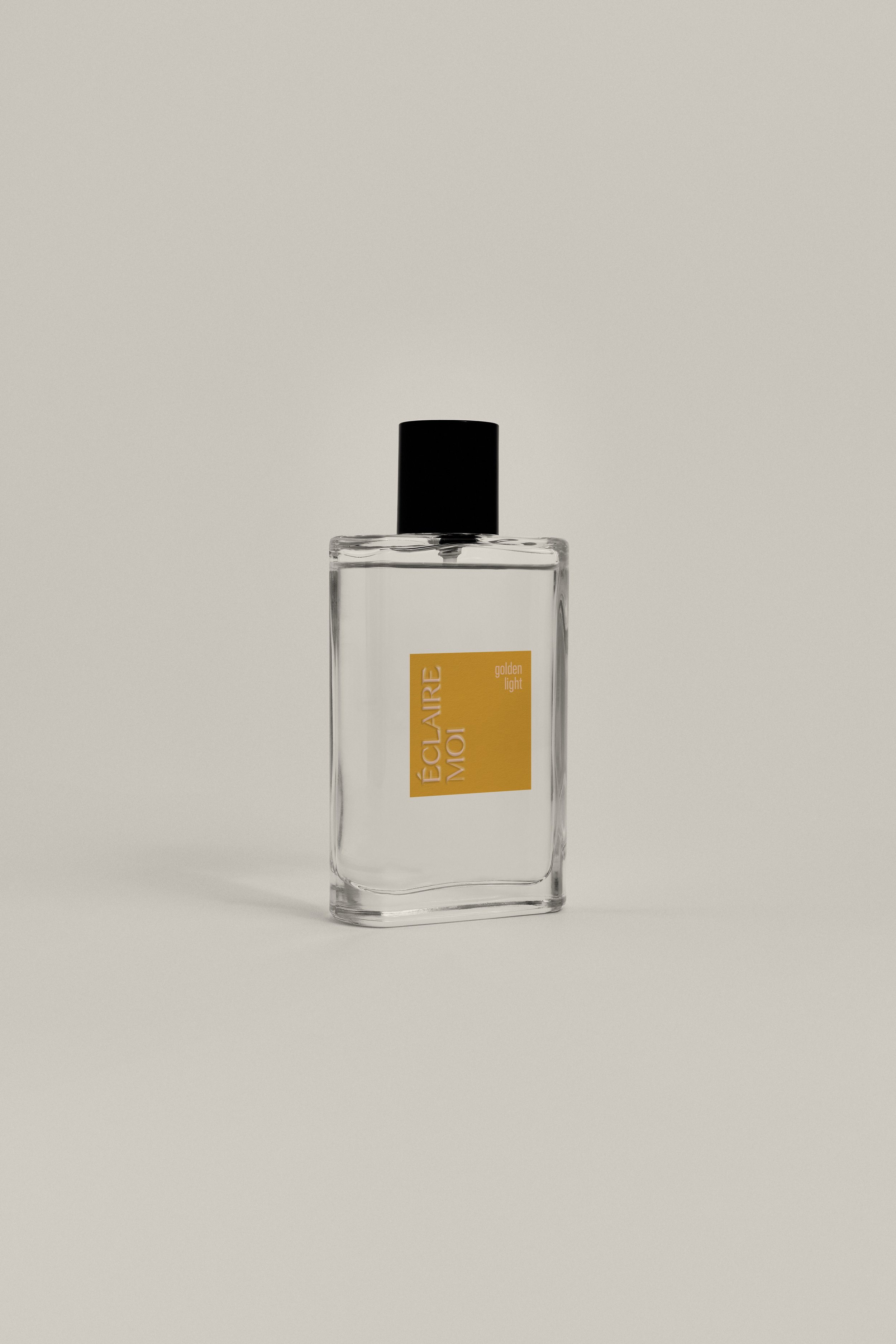
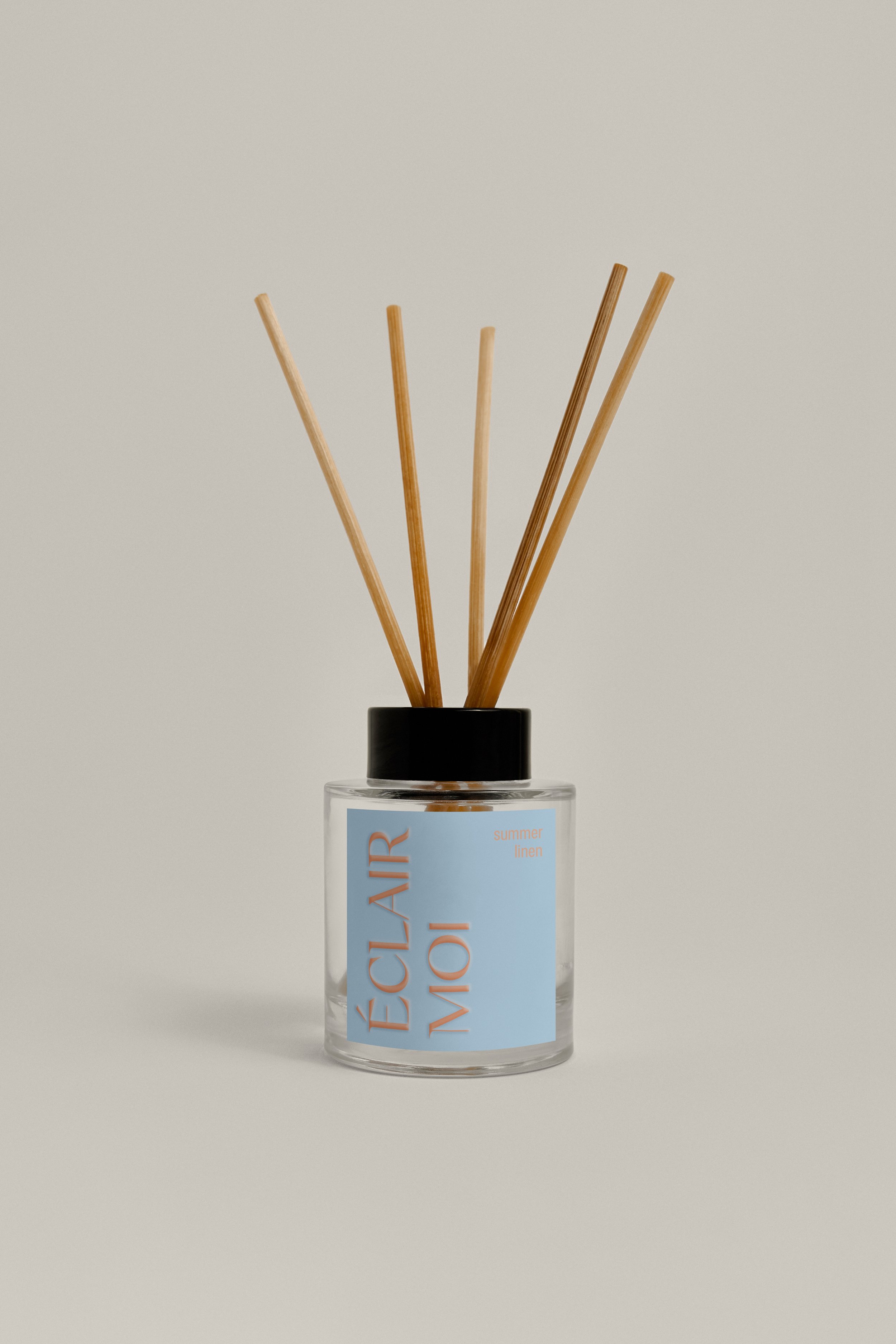
Eclair Moi is a conceptual fragrance brand focusing on fun, bold minimalistic style. This brand would add style to any home, with its simplistic visual design, focusing more on bold colours and quality finishes.
The style of design would fit in minimalist and maximalist homes with colours and fragrances to suit all. Simple and elegant with a touch of flair, Eclair Moi would brighten up any kitchen counter, candlelit bath, or coffee table.
The retro block colours paired with a modern main font (Champagne Cartel by Tropical Type) and clean sub font (SF Pro Compressed Regular) create a beautiful mix of old and new. The embossed logo on the packaging elevates the design to make it feel classier and higher quality. The aesthetically pleasing bright colour theme would draw any consumer's eye on the shelf, both by themselves and arranged next to each other.


![clairemoi [Recovered]-21.png](https://images.squarespace-cdn.com/content/v1/64d369dc45442218070de033/78087587-ead8-4683-8c6c-1ad00ce7a993/clairemoi+%5BRecovered%5D-21.png)
![clairemoi [Recovered]-59.png](https://images.squarespace-cdn.com/content/v1/64d369dc45442218070de033/568cfceb-c834-4144-bef3-da25f8c87be0/clairemoi+%5BRecovered%5D-59.png)
![clairemoi [Recovered]-23.png](https://images.squarespace-cdn.com/content/v1/64d369dc45442218070de033/63a41264-6340-44fd-9e6e-12b0cf49ba3e/clairemoi+%5BRecovered%5D-23.png)
![clairemoi [Recovered]-61.png](https://images.squarespace-cdn.com/content/v1/64d369dc45442218070de033/7417e01b-cd70-4608-9899-d13edbaa1115/clairemoi+%5BRecovered%5D-61.png)
![clairemoi [Recovered]-27.png](https://images.squarespace-cdn.com/content/v1/64d369dc45442218070de033/d6369354-a5a6-4f18-93b6-434912a960e6/clairemoi+%5BRecovered%5D-27.png)
![clairemoi [Recovered]-65.png](https://images.squarespace-cdn.com/content/v1/64d369dc45442218070de033/e44dcb33-2649-4fc8-9fd4-f34d941a7216/clairemoi+%5BRecovered%5D-65.png)
![clairemoi [Recovered]-24.png](https://images.squarespace-cdn.com/content/v1/64d369dc45442218070de033/f54b0739-46c8-40ac-a6b6-5b61f28e72f9/clairemoi+%5BRecovered%5D-24.png)
![clairemoi [Recovered]-62.png](https://images.squarespace-cdn.com/content/v1/64d369dc45442218070de033/5191c590-f23b-449b-81b1-69b0ff94694f/clairemoi+%5BRecovered%5D-62.png)
![clairemoi [Recovered]-22.png](https://images.squarespace-cdn.com/content/v1/64d369dc45442218070de033/0e4b3ec1-d98f-4e1c-91f0-558de0321ab9/clairemoi+%5BRecovered%5D-22.png)
![clairemoi [Recovered]-60.png](https://images.squarespace-cdn.com/content/v1/64d369dc45442218070de033/2b984721-9a3d-453b-b104-93e4392b94a0/clairemoi+%5BRecovered%5D-60.png)
![clairemoi [Recovered]-25.png](https://images.squarespace-cdn.com/content/v1/64d369dc45442218070de033/7a718514-d164-459b-befb-55afb1df308b/clairemoi+%5BRecovered%5D-25.png)
![clairemoi [Recovered]-63.png](https://images.squarespace-cdn.com/content/v1/64d369dc45442218070de033/8774a6c1-51f2-4397-a20e-a8e3f2b7d360/clairemoi+%5BRecovered%5D-63.png)
![clairemoi [Recovered]-26.png](https://images.squarespace-cdn.com/content/v1/64d369dc45442218070de033/c52463f0-4b09-4aea-985e-a63dff25fa49/clairemoi+%5BRecovered%5D-26.png)
![clairemoi [Recovered]-64.png](https://images.squarespace-cdn.com/content/v1/64d369dc45442218070de033/3207ad21-fac6-4c9c-bd2f-16db7169cde4/clairemoi+%5BRecovered%5D-64.png)


Eclair Moi branding is joyful, yet relaxing and not overwhelming, with room to allow the brand to expand into more product areas and design collaborations. Some suggested areas would be extending the brand to include perfume fragrances, matchbooks, diffusers and hand creams.


It could also lend itself to collaborations with brands and special edition products, such as Barbie, Wedding gifts, and Christmas fragrances. Gold foil and embossing and hand lettering immediately elevate these designs and add an extra special element to an already beautiful product.
Eclair Moi; the perfect gift for someone else, or for yourself!


Thanks for viewing this project! Stick around for more fun design stuff…


